The islet iOS app shipped a day ago with four screens. It already felt like too many. The food logger had five stacked tag pickers, a chat interface hidden behind a button, and a meal history on a separate screen. Every meal entry meant navigating in, filling out a form that looked like a medical questionnaire, then navigating back. The data was right. The experience was wrong.
Safety note: islet is a personal project and is not medical advice. It does not make dosing decisions. All carb estimates are informational only.
The problem with cards
The original design followed a pattern that felt safe: cards. A card for the glucose reading. A card for the food form. A card for the meal list. Each card had a border, padding, a header, and content inside it. Stack enough cards and you get a scrollable filing cabinet.
The food form was the worst offender. Five nutritional tag pickers — fat, protein, fibre, glycaemic index, absorption speed — each rendered as a horizontal row of buttons. Every row looked identical: grey buttons on a dark background, the selected one highlighted in amber. Five identical rows, one after another, each requiring you to read the label to know which nutrient you were setting. And two of them — GI and absorption speed — were measuring the same thing from different angles. If you know the GI and the fat/protein/fibre content, the absorption speed is already implied.
When everything looks the same, nothing communicates.
The fix was not to remove the tags. They carry real clinical value — knowing that a meal is high-fat and high-protein tells you the carb absorption will be slower, which changes how you think about timing. The fix was to make each tag visually distinct and to hide them until they’re needed.
Colour as data
Each nutritional dimension now has its own colour:
Purple for fat, blue for protein, teal for fibre, amber for glycaemic index. Four colours, four dimensions. These appear everywhere — in the input grid, in the meal timeline tags, in the AI estimation review. Once you learn that purple means fat, you never need to read the label again. Absorption speed was dropped entirely: GI tells you how fast the carbs hit; fat, protein, and fibre tell you what slows them down. A separate speed picker added input burden without adding information.
The tag pickers collapsed from five stacked rows into a 2×2 grid of coloured cells. Each cell is a dropdown menu: tap, pick a value, done. The grid hides behind a “Nutrition details” toggle that stays collapsed by default. A small amber dot appears next to the toggle when any tag is set, so you know at a glance whether you’ve added nutritional metadata without opening the section.
One screen
The biggest structural change is in the core flow: the dashboard, food logger, and today’s meal timeline now live on one scrollable page instead of separate primary screens. Settings and full meal history still exist as separate destinations, but the everyday logging path stays in one place.
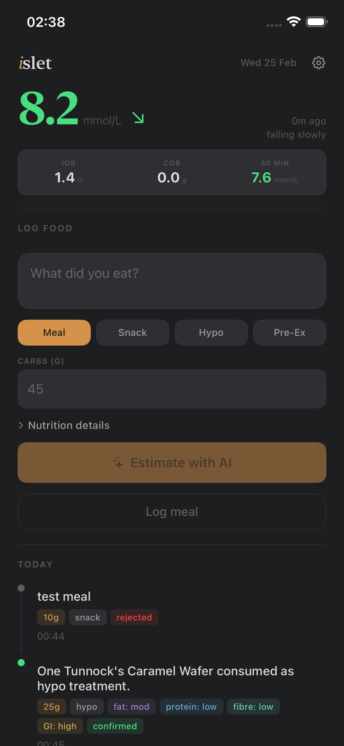
From top to bottom: the glucose reading (large serif number, range-coloured, with direction arrow and age). A compact metrics bar showing IOB, COB, and 30-minute prediction. A divider. The food input zone. Another divider. Today’s meal timeline. A disclaimer at the bottom.
The question shifted from "where do I go to log food" to "I'm already there."
Far less navigation in the common case. No extra sheet presentations for routine logging. You scroll down, type what you ate, tap a button. The AI estimation opens as a sheet only when needed — it’s the one interaction complex enough to warrant its own context.
AI first, manual fallback
The previous design treated AI estimation as an afterthought: a small “Ask ChatGPT to estimate” button below the manual entry form. The new design inverts this. The primary amber button says “Estimate with AI.” Below it, a subtle outline button says “Log manually (I know the carbs).”
Tapping the manual button reveals the carbs field and the nutrition grid. Tapping AI sends the food description to the estimation endpoint. When the AI responds, the carbs field auto-fills with its estimate, the nutrition grid lights up with whatever flags it detected (high fibre in teal, quick carbs in gold), and the button changes to “Log meal.”
The AI does the tedious work. You do the verification.
The timeline
The meal list became a timeline. Each entry has a small coloured dot — green for confirmed, amber for unconfirmed, red for rejected — connected by a thin vertical line. The dots give an instant visual read of your day’s meal status without parsing any text.
Below each entry, nutritional tags appear as small coloured pills that wrap naturally: 30g in amber, meal in grey, fat: high in purple, protein: mod in blue, GI: med in amber. Only non-trivial tags appear — no fat: none clutter.
Unconfirmed meals show ghost-style Confirm and Reject buttons with coloured borders. Confirmed meals show nothing extra. The timeline tells you what happened today at a glance.
Cross-platform
The web UI got the same treatment. Same warm charcoal background, same amber accent, same nutritional colour system, same timeline layout, same AI-first workflow. The web version is a single HTML page embedded in a Python string — no build step, no framework, no dependencies. It renders the same on a phone browser as it does on a desktop.
The iOS app and the web app now share a design language without sharing any code. The consistency comes from the colour tokens and layout patterns, not from a component library.
What changed
The data model didn’t change. The API didn’t change. The same endpoints serve the same JSON to the same clients. Every change was in the presentation layer — how the data is arranged on screen, how interactions flow, and how colour carries meaning.
The app moved from four competing screens to one primary logging surface. The tag pickers went from five identical rows to a colour-coded grid behind a toggle. The meal list moved from a flat table to a timeline, while full history remains available on its own page. The AI estimation went from a hidden option to the primary action.
It still logs food. It just gets out of the way faster.